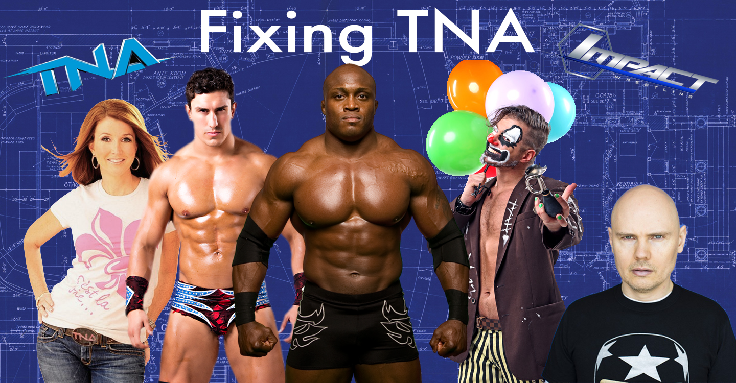
 News broke late last week that the much maligned Dixie Carter is officially leaving TNA and former Resistence Pro booker (and Smashing Pumpkins frontman) Billy Corgan is now fully in charge. While the shake up isn’t a totally lateral move, Corgan is by no means a guaranteed savior. Dixie made some questionable business decisions (Hogan, Bischoff, Russo) but TNA isn’t a victim solely of bad management or booking. There is something deeper, maybe even intangible. Can Corgan diagnose and cure TNA’s phantom plague? It’s an uphill battle but it’s not impossible. This week, we’re going to dedicate a post a day to TNA giving an outsider’s perspective on the problems we see. Here’s our first edition of Fixing TNA…
TNA: The Website
When I need something for my house, when I want info for a blog post or when I’m looking for anything…ever… I go to a website or check Google. Let’s get some info on TNA, shall we? Let’s go to TNA.com!
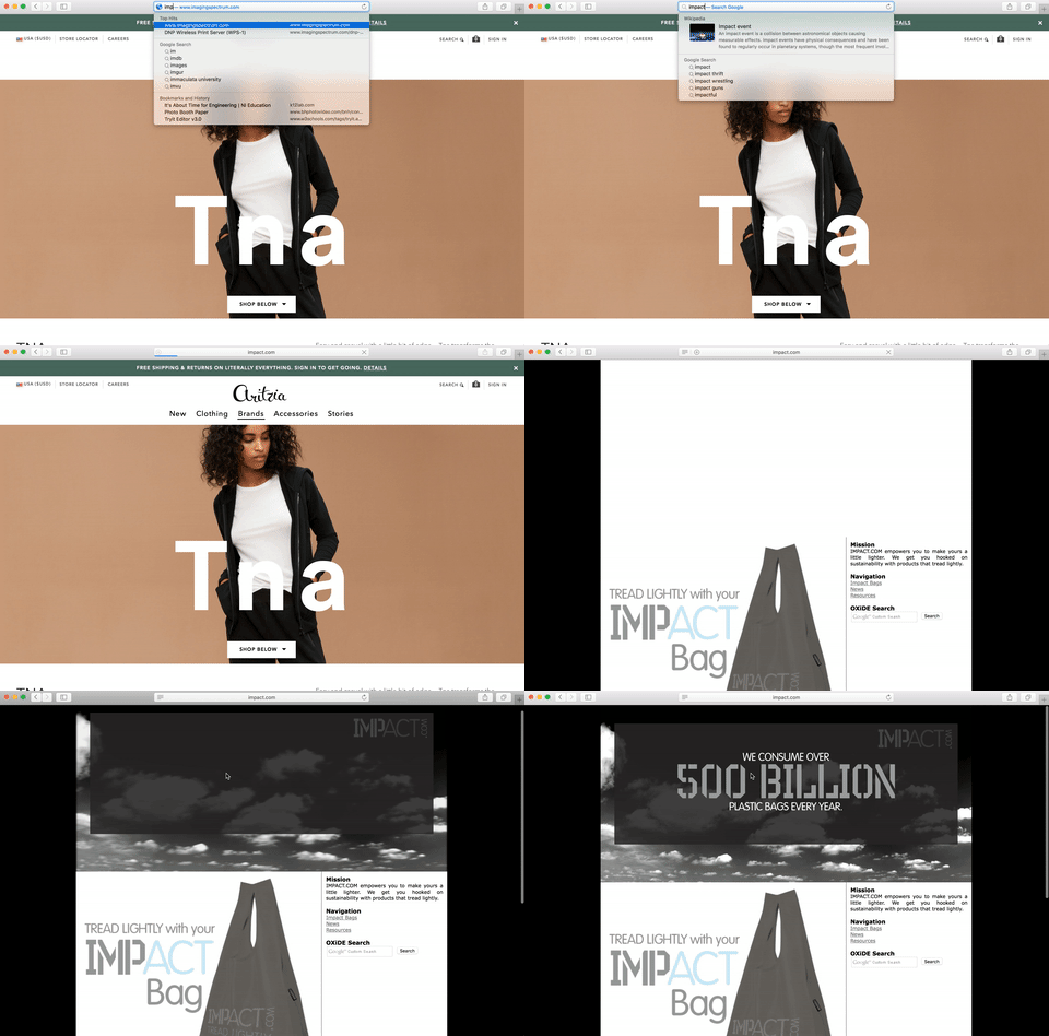
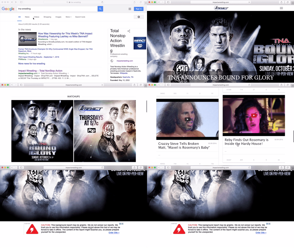
Going to ImpactWrestling.com (Don’t go to ImpactProWrestling.c0m, that’s a different company), you’re greeted by a large photo and a menu with two items: Impact and ShopTNA.com, followed by a Google AdSense space. A large photo, menu and ads are all regular parts of modern web design, so these things are acceptable even if they’re not particularly attractive on this page. When you click on Impact in the menu, it just reloads the site. When you click ShopTNA.com, it takes you to another site and when you click the image, you’re re-directed to a blog post about the image. We’ll get to both of those a bit later*. Scrolling down, there is a section called Match Ups with two random uninformative pictures. When you click on those, it enlarges the thumbnail and just shows the picture larger. No additional information. No nothing. A waste of a click and space.
After that is a section for Highlights which features 12 of Impact’s most recent YouTube videos. Video (along with GIFs) are the current bread and butter of media rich sites but the randomness of these videos does TNA/Impact no favors. If I’m trying to find out info on the brand or what makes them different, I shouldn’t be plopped into the center of one of their storylines via a video. TNA should be using their website to educate their prospective fans. As ratings indicate, they don’t have the luxury of assuming we know anything about their brand. Another downside to this: On mobile devices, this list of twelve videos is listed one by one by one by one by one, etc which means a lot of scrolling.
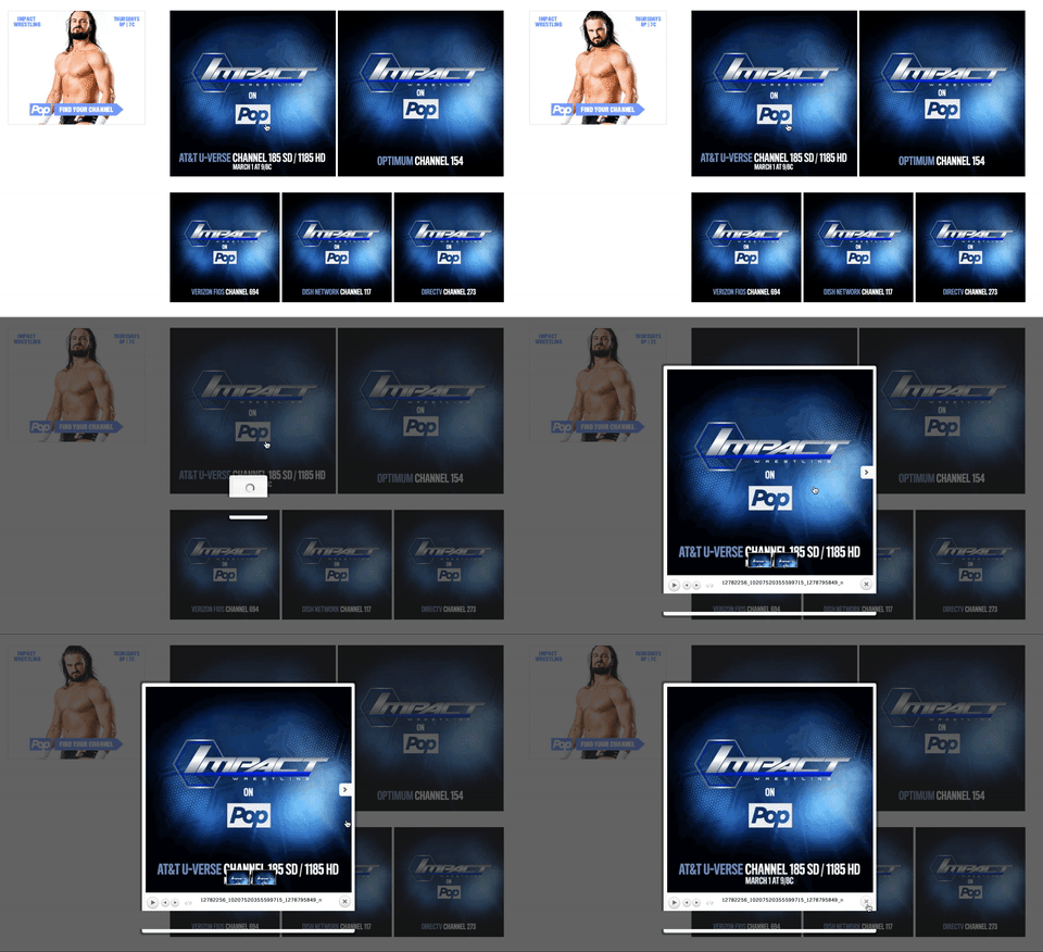 Next, I’m offered the opportunity to find the POP TV channel in my area. I’m once again greeted by images that link to thumbnails. Click. Nothing. Click. Nothing. Click. Nothing. I could do this all day and still not know where to find it on Comcast Xfinity. So how do I find it on Xfinity? By clicking that area under the uber-talent Drew Galloway. Not on Drew, not on Pop, just on “Find Your Channel” where I’m prompted to enter my zip code. This crucial info and aspect can so easily be missed. Too easily missed. Like the videos, these channel pictures appear one after another on mobile. More scrolling.
The last thing on the page is a grid of Impact’s 12 most recent Instagram pictures, another Google AdSense adspace, 3 unexplained/unclickable pictures of the 3 major credit card companies and a PayPal logo. That is TNA’s Homepage.
Back to the top, when you click the large image (in this case the Bound for Glory announcement), you’re redirected to a blog post about the event. The post has very limited information about the event but it does include a video featuring Josh Matthews and McKenzie Mitchell that covers some of the overlooked details, such as where the event is taking place. Still missing on the page is where to get tickets, when they go on sale, any mention of the new Impact Grand Championship and any information on how to order the pay per view.
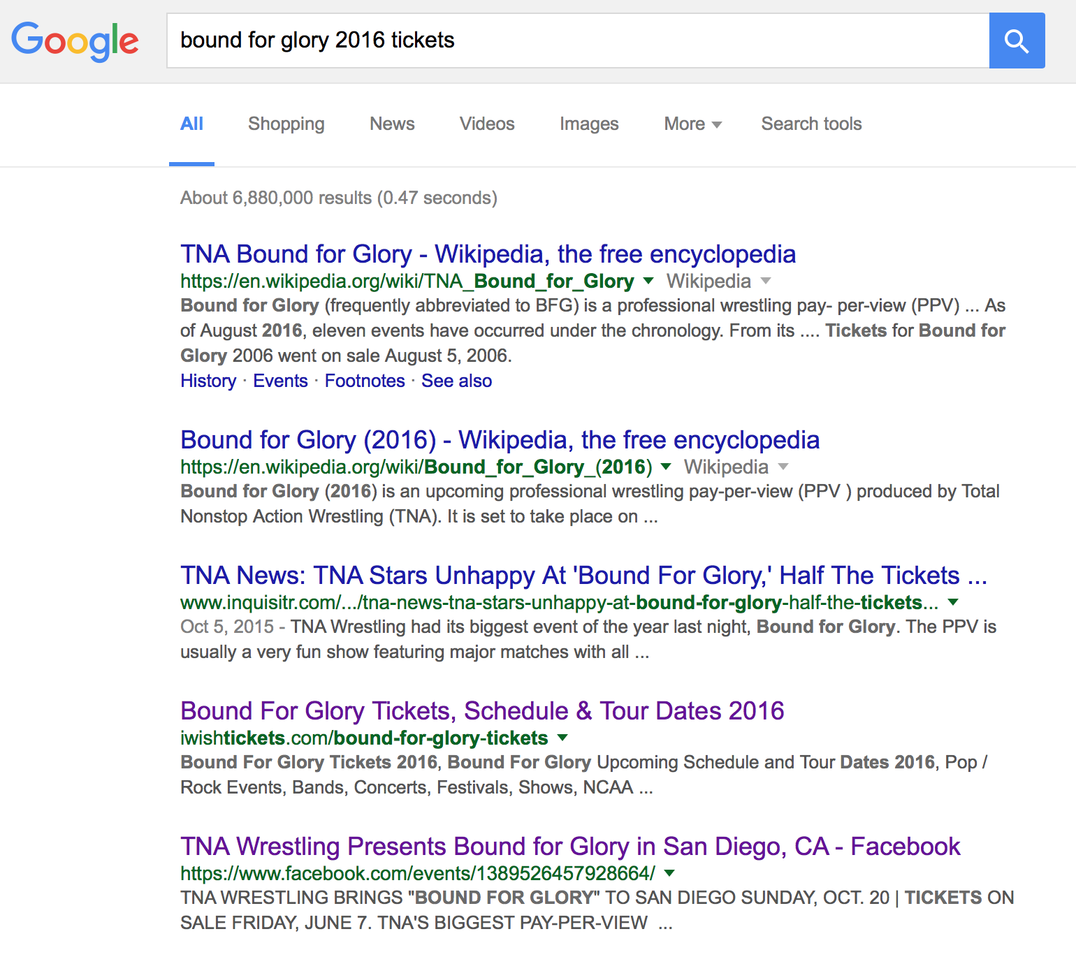
Don’t waste your time Googling it either. You get no information. See, for as much as TNA utilizes social media, pictures and videos, Google and other search engines can’t decipher the visual or verbal content included in those. So when people search for certain things, there needs to be a sentence or two about it in plain text somewhere on the Internet in order for the information to be searchable. TNA doesn’t do that. Plus, social media content doesn’t do well in Google searches, nor is it a viable form of archiving.
Oh by the way, did you want to see a schedule of upcoming live events? Results? Buy tickets? How about a roster of all the wrestlers and knockouts? Anything about the history of the company? Images from events? A place to search for anything on TNA.com Impact.com ImpactWrestling.com? A list of every blog post, category or tag? Good luck because it’s not there. None of it.
Recommendation for Fixing TNA:
- Get a better web site (See ImpactProWrestling.com for tips)
Note* I abandoned exploring ShopTNA.com when I was unable to get it to load on any of my laptops. Mobile; it loads, but not on my laptop. So I’m ignoring it entirely…the same way TNA ignores proper search engine optimization and web development.




[…] with the task of diagnosing the plague that’s held back TNA from ever gaining ground on WWE. Yesterday we began to look at every aspect of TNA in an effort to start fixing it. Today, we look at another […]
[…] why we’ve been giving an outsiders’ perspective on fixing TNA all week long. We simulated the experience of a fan searching for more info on TNA.com Impact.com TNAWrestling.com ImpactWrestling.com. It […]
[…] of the matter is: they really are improving. Earlier this week, we outlined two minor changes (improve website & clarify name). Yesterday, we opened a new can of worms that required our thoughts to be split […]
Comments are closed.